AI Signal Logo

AI Model Landing Page Showdown

Your 5-minute AI briefing — no hype, just signal.

We gave three frontier AI models the exact same prompt: "Build a landing page for LedgerLocal, a local-first invoice processing tool." Here's what they created—and our honest take.

🔬 AI Signal Experiment

The Reviews

🧠

Claude Opus 4.5

Anthropic's flagship reasoning model

9.2 / 10

✅ Strengths

  • Exceptional Visual Hierarchy: Clean white background with sophisticated slate/indigo palette. Feels like a Fortune 500 product page.
  • Killer Pricing Strategy: Uses a comparison table to pit the $149 one-time cost against $300+/year competitors. Highly persuasive.
  • Floating UI Badges: The hero image includes animated badges ("Export to Excel", "Local Processing") that visualize the value prop without needing to read.
  • Fully Responsive: Perfect mobile layout with collapsing nav and logical content stacking.

⚠️ Weaknesses

  • Minimalist Footer: Could benefit from newsletter signup or more detailed links to match the rest of the page's polish.
  • No Dark Mode: Missed an opportunity for an optional dark theme toggle.

🎯 Our Verdict

Claude Opus didn't just generate a page—it designed a conversion-focused sales funnel. This is the kind of output you'd expect from an experienced product marketer, not a language model. Ready for production.

📸 Hero Preview
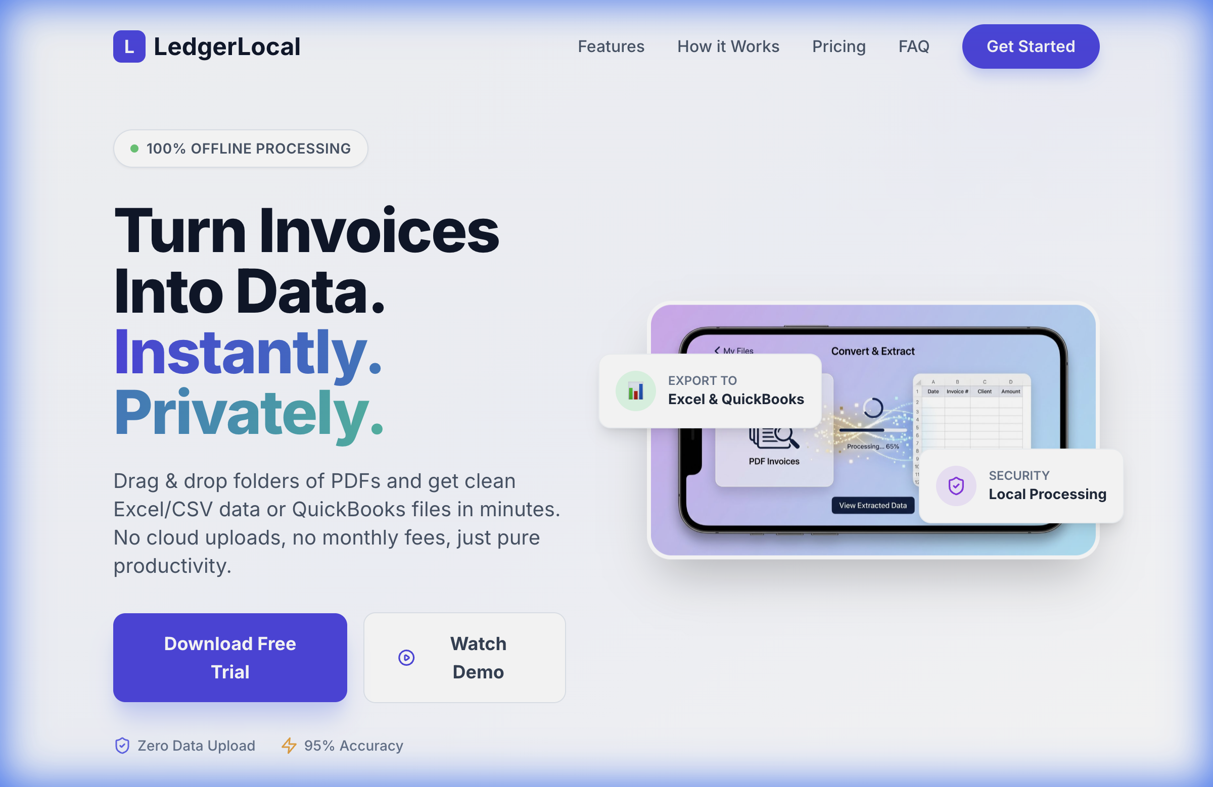
Claude Opus 4.5 Landing Page Preview
View Claude Opus Page →

Gemini 3 Flash

Google's speed-optimized model

8.8 / 10

✅ Strengths

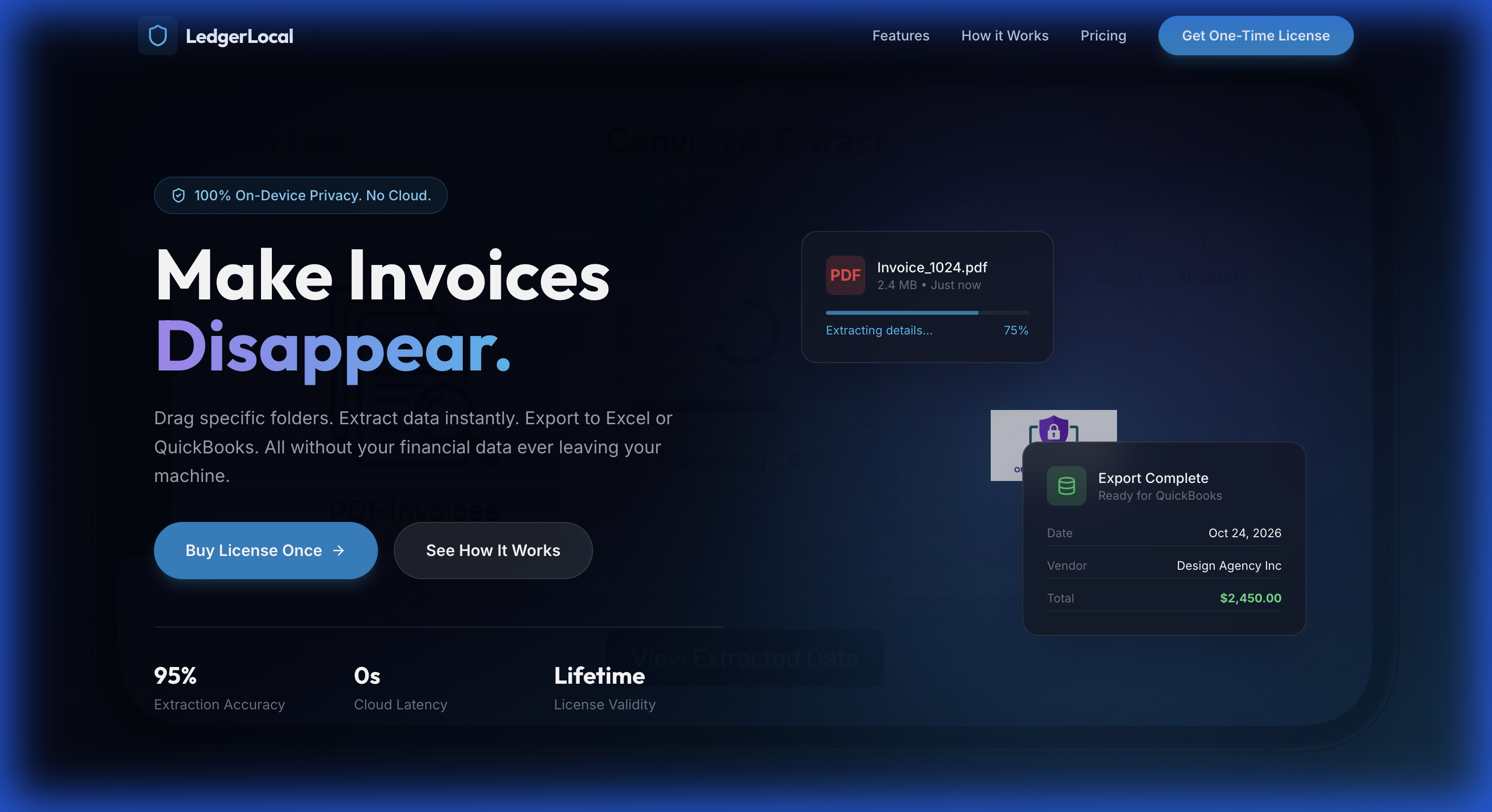
  • Punchy Headline: "Make Invoices Disappear." — Immediately captures attention with a benefit-focused message.
  • Dark Glassmorphism: Trendy, modern aesthetic with blue neon glows. Feels premium and "techy."
  • Strong Pricing Comparison: Shows $149 lifetime vs. $696 over 2 years for competitors. The math does the selling.
  • Smooth Animations: Hover effects and functional FAQ accordions add polish without slowing the page.

⚠️ Weaknesses

  • Abstract Hero: The background imagery is very blurred/subtle. A clearer product screenshot would ground it better.
  • Less Content Depth: Faster to build, but some sections feel thinner than Opus's output.

🎯 Our Verdict

Gemini Flash lives up to its name—this is a fast, effective landing page with a bold dark-mode aesthetic. The headline alone is worth studying. Great for founders who want something polished quickly.

📸 Hero Preview

Gemini 3 Flash Landing Page Preview
View Gemini Flash Page →
💎

Gemini 3 Pro

Google's most capable model

9.0 / 10

✅ Strengths

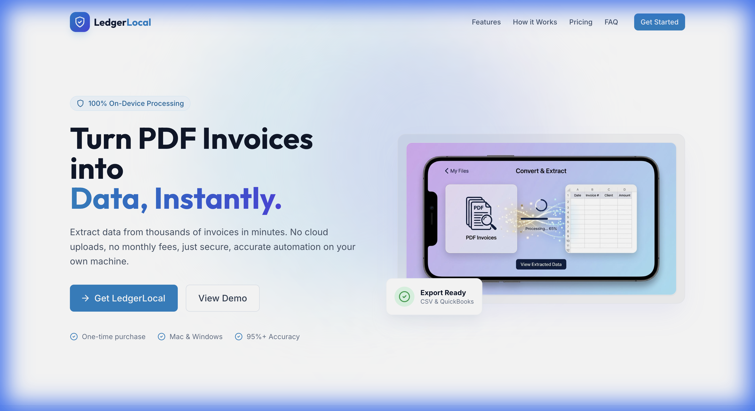
  • SaaS-Ready Polish: Clean whites, brand blues, and excellent typography. Looks like a real funded startup's site.
  • Privacy-Forward Messaging: "100% On-Device Processing" badge is front and center. Knows its audience.
  • Excellent Mobile UX: Navigation collapses to a clean hamburger menu; all sections stack perfectly.
  • Simple Pricing: Single $99 card with "One-Time Purchase" highlighted. No confusion, no decision fatigue.

⚠️ Weaknesses

  • Placeholder Buttons: "View Demo" doesn't link to an actual demo (typical for AI mockups).
  • Brief FAQ: Answers are short; could be more detailed for skeptical buyers.

🎯 Our Verdict

Gemini Pro delivers enterprise-grade aesthetics with a clear focus on trust and privacy. The design decisions feel intentional, not accidental. This page could launch today.

📸 Hero Preview

Gemini 3 Pro Landing Page Preview
View Gemini Pro Page →